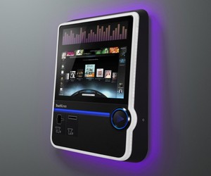
The last product I worked on at frog has been out for a couple of months now - the Virtuo jukebox for Touchtunes. Touchtunes was a fantastic client, with an insanely dedicated team, and I was sorry to leave mid-project. So I’m really happy to see how great the final version looks and to see it get good press.
There are two key things I learned on this project about jukeboxes, which you can see for yourself in any bar you walk into with an actively-used jukebox. One is that they are still social centers. People gather around them in groups, they choose songs together, and they spend time thinking about how their choices will improve, or ruin, other people’s experience in the bar itself. The other is that modern jukeboxes, freed of the need for racks of CDs, freed in fact from the need for any physical controls other than the cash and credit card acceptance slots, have become unremarkable-looking. I’ve walked past jukeboxes in bars, thinking they were ATMs. And if the customer doesn’t know that the jukebox is there, they aren’t going to play it.
There are physical cues from old jukeboxes that newer jukes can use to tell you what they are: the columns of bright lighting up the sides, the domed top that feels like something out of Happy Days. Those cues get the point across, but they say “I’m like this other device you used to use” as much as “I’m a jukebox.” As a result, I think they have the side-effect of making the jukeboxes feel weirdly dated from the first day they’re on the market.
What I really love about the Virtuo is the way the physical form says “I am a jukebox” in a new way. And central to that is the big physical “Play” button. Even if the screen is running ads, or off entirely, you have no doubt what this device is for, because that play symbol is so universal. The cues are no longer the cues of the old jukebox, because the way we experience music has changed so radically. In incorporating a symbol that means “play music” today, the Virtuo marks itself as both a jukebox and as entirely up-to-date.
When the iPhone was new, I had a conversation with Luke Williams in which we wondered aloud about what would happen to industrial design in the brave new world of the touchscreen. What this project taught me is that sometimes, one button is all you need, as long as it’s the right one.
(For more on the importance of buttons, and their changing role in interaction design, go check out the work of my friend Bill DeRouchey, and in particular his great presentation on the history of the button from SxSW.)
