• Portfolio
  • Writing
  • About
  • Blog
  • Contact

Michele Tepper

  • Portfolio
  • Writing
  • About
  • Blog
  • Contact

Failing at focus groups

Back in March, I was part of a focus group for an online shopping site. I’m not a big fan of focus groups - there are too many interpersonal dynamics at work and I think you get better, more authentic responses in an interview. But it was $100, and an opportunity to be on the other side of the table for a change, so I was legitimately psyched walking in to the session.

Unfortunately, it wasn’t the good experience I was hoping for. I’ve sat on my post about it for a while, unsure whether I wanted to say anything publicly, but I think it’s worth it if it helps anyone stumbling across this post run a better user research session in the future.

The first thing I noticed, after checking in at the door, was that there was no release or mutual NDA for me to sign. Then, they immediately wanted to take my picture. I said I wasn’t comfortable with that, and they didn’t pressure me, but the same photographer was snapping away throughout the two hour session, and I am sure there were plenty of photos of me in the mix.

I know that the NDA is an easy piece of paper to forget or handwave away as unnecessary; I’ve done it myself in the past. That was a mistake. Don’t ever skip the NDA, especially if you’re taking pictures or video. I was surprised to discover how much having my picture taken during the session threw me out of the experience and put me on my guard, all because I didn’t have confidence that my picture wouldn’t end up on some corporate promotional site somewhere.

(And for those of you who say “oh, we’d never do that; we’re really careful with our confidential research material!” let me tell you a story I heard from someone who worked in-house: one of her designers took all the pictures they’d taken during a usability session and proudly posted them to the corporate Flickr feed. Only being reminded of the mutual NDA that all the testing participants had signed got the designer to take them down. Now you can say, and rightfully so, that this story proves NDAs aren’t guarantees someone’s privacy will be respected. But at least they give the interviewee some confidence and some recourse if it isn’t. Don’t skip this step.)

The second thing I noticed were the set of cafe tables on the far side of the room, and the group of people who all seemed to know each other sitting there and chatting. Oh, that can’t be the clients, can it? I thought. Yes it can. The moderator, from a small SF-based brand research company, tried to explain that it was more “authentic” for the team from the online shopping site to be in the room with us, that you can’t really grasp all of the nuances of body language and the subtlety of interpersonal communication while eating M&Ms behind a one-way mirror.* If anyone ever tries to sell you, as a client, on this being the best way to do research, please show them the door, because they are talking nonsense. Don’t be in the room observing your focus group.

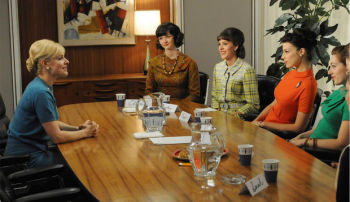
Photograph © AMCThere is a huge body of research that shows that people’s behavior, perceptions, and attitudes are changed by their environment, and part of their environment is the people who around them. Doing user research, one of your biggest challenges is getting people comfortable with an extremely artificial situation, one in which you are paying them for their opinions on something that the typically believe (rightly or wrongly) that you have some personal investment in, so that you can get past polite awkwardness and into something like truth. When you feel yourself being watched by the people who want your opinions, it’s going to change what you say, and make it more what you think they want to hear. 

What’s more, the rationale that the clients could see us better out from behind a one-way mirror was ridiculous on the face of it, because they were sitting behind the table, which meant they were staring at the back of two focus group members’ heads. Lots of ability to see the nuance of what was going on there, indeed.

I’ve spent some time trying to figure out what led the brand consultancy to use this weird setup, and I’ve only come up with two possible answers. One is that they had us get up and look at images pinned to the wall, and in a typical focus group room, that would have been harder. The other is that, since they were specifically targeting people who live in Brooklyn, they wanted to make sure the sessions were in Brooklyn, and they couldn’t find a proper research facility outside of Manhattan. These are both understandable concerns, but neither of them are insurmountable, and neither one is worth giving up whatever measure of critical distance that not having the people paying for the research in the room during the research can provide.

The final thing I noticed was the composition of the group. Out of the ten women at the table, two were in marketing, one worked in branding, and three (including one of the marketers and me) had experience running focus groups. I can almost make an argument that if you want Brooklyn tastemakers, you want to include a few people whose job involves branding and marketing, but even so, you need diversity, and more people who don’t know how the sausage is made. Screen your focus group members effectively.

Portigal Consulting, one of the top user research consultancies on the West Coast, talks about the complexity of writing a good screener on their blog, with links to a sample screener. If you go to that screener (which is a great example of a script for a recruitment firm), you’ll see that a lot of the early questions are looking for, and getting rid of, people just like the ones who were around that table. Why? Because most people don’t work in marketing and user research, and don’t think like them. Just like I wouldn’t want to just take a programmer’s word on what makes for a great piece of consumer software, I wouldn’t take a marketer’s word - or my own word! - on what makes a compelling online shopping experience. We’re not the typical user, and we think about it differently than the typical user would. It’s precisely to get that perspective from the other side of the interaction that you do user research and focus groups in the first place. 

I went home that night annoyed in the way that only a job badly done can annoy you, and wrote an angry bunch of notes for this post. Then I unsubscribed from the site’s mailing list. I spent the honorarium on framing art that I bought somewhere else.


* The only downsides I have ever found to being in an observation room in a testing facility are (a) overdosing on M&Ms and (b) since Mad Men started, people who are new to user research come in and say “I feel just like Don Draper!”  

tags: Design research, focus groups, what not to do
categories: Product design, Technology
Tuesday 05.15.12
Posted by Michele Tepper
 

Info-viz Everywhere

In the "why did nobody think of this sooner?" product development category comes the Knitter's Pride Dreamz from Webs, a large knitting supplies store. The needles, made of a laminate birch wood, are color-coded by size.

This may seem like a small thing to non-knitters, but if you've ever sorted through a set of similar sock needles, the sizes of which can vary by just a few millimeters in diameter, searching for a set of five that match, it's something of a Eureka! moment.

There's also an interesting product development story deducible from this launch. One of Webs' competitors, KnitPicks, also makes wooden needles out of a birch laminate, but theirs are multi-colored. Webs had market validation that knitters would buy brightly-colored needles made of this material, and likely no desire to step into the interesting legal thicket surrounding the KnitPicks design. Whether it was because they were consciously looking for a differentiator, or the opportunity for making knitters' lives easier just independently struck someone on their team, it's a super-smart choice, and deserves a spot on the top of any knitting designer's holiday wish list. (cough, cough)

(image from yarn.com)

tags: knitting, infoviz
categories: Product design
Tuesday 11.08.11
Posted by Michele Tepper
Comments: 5
 

Circling the Nest Thermostat

Last week, Nest Labs launched a new programmable thermostat. It got a lot of press, not just because it’s expensive and innovative and beautiful, but because Nest Labs was founded by Tony Faddell, who led the iPod team for years, and senior leadership includes other key iPod team members and a MacArthur fellow.

I’ve spent a fair amount of time over the last year and a half thinking about programmable thermostats, and how to help homeowners save money by managing their energy use. Some of those thoughts I’m going to have to keep to myself, even though I’m no longer at EnergyHub, but there are a few things not directly related to my work there that I haven’t seen discussed in all of the hullaballoo, and I think one in particular is worth spending some time on. 

Which is to say, I was really struck by the physical form of the thermostat itself. The company’s video tour highlights one of the cleverest touches - the stainless-steel outer case that allows it to blend more cleaning into the surrounding wall. After all, the whole reason most thermostats are beige is that it’s the lowest common denominator—Nest is solving the same problem more elegantly (though I do wonder about finger smudges…). But I really liked most of all that it’s a circle.

Image copyright Nest Labs

I grew up with a boxy beige thermostat with little lever-ish setpoint markers on the top. So to me personally, there’s nothing particularly resonant about the circular form factor. But after spending a lot of time talking to people about home HVAC systems, I know that l’m in the minority on that. The circular thermostat from Honeywell, designed by the great Henry Dreyfuss, is a minor icon of mid-century modernism: it’s just what a lot of people think of when you ask them to visualize a thermostat. The digital thermostat moved away from that shape to mark itself as something new (and also, to be frank, because it needed more space for its components). In time, the rectangular form factor became a marker of technological advance: you had something digital, programmable, and new.

The Nest Learning Thermostat takes another technological leap forward: it’s billed as a thermostat that learns its program from your behavior. It’s a thermostat with actual intelligence - possibly a scary thought on a cold night! How do they make it seem friendly and familiar regardless? Return to the circle. After the age of the impossible-to-program digital thermostat, the circle not only says “thermostat,” it says “simple and familiar.” From the manufacturer’s side, having the primary control be the stainless steel ring around the outside cut out the cost of a custom touchscreen component, and gave the design team the opportunity to design controls that (at least in the video) feel almost analog and yet highly precise at the same time.

The original iPod’s physical design, on launch, was constantly compared to a deck of cards. It needed to be small, to travel well, and it needed to be iconic, to stand out among the crappy existing options. The white earbuds were a brilliant touch, letting you display to everyone else at the gym or on the train how ahead of the curve you were. At home, though, it’s at least as much about comfort as display. A familiar form, an organic shape, something that’s beautiful up close but blends in at a distance, that’s what makes the Nest thermostat look premium in the home, and it’s almost the exact opposite of what made the iPod look premium in 2001. I still have a lot of questions about the Nest Learning Thermostat, but I’m beyond impressed by how much the people who made it know about making highly desirable consumer objects, and how much they were willing to learn from a classic. 

tags: industrial design, nest, thermostats
categories: Product design
Tuesday 11.01.11
Posted by Michele Tepper
Comments: 2
 

Never trust a computer you can’t lift

Last night, in her reporting on Steve Jobs’s death, Rachel Maddow played a clip from the introduction of the very first Macintosh. If you’ve never seen it before (and I don’t think I had) it’s worth a watch:


At around 3:22, the voice synthesizer on the Mac reads this phrase:
I’d like to share with you a maxim I thought of the first time I met an IBM mainframe: NEVER TRUST A COMPUTER YOU CAN’T LIFT!

The crowd at the demo goes nuts at this, as they should - it’s a well-phrased snark at the then industry standard. But watching it now, with my iPhone, iPad, iPod, and MacBook all close at hand, it’s a promise of the future.

What “never trust a computer you can’t lift” really means is that your computer should fit into your life, not the other way around. The first Mac didn’t just have the infamous handle, it had a carrying case  so you could take it to class with you.  It had a graphical user interface and a mouse, so you didn’t have to spend years in school, or keep a cheat sheet of key commands on your desk, to get it to add 2+2. It made it easy to make things look good, because people appreciate beauty, and it had an engaging personality. One of my friends kept his Mac Classic alive and running well into the 90s; when another friend walked into his apartment and saw it, she ran up to it and gave it a hug. 

Steve Jobs didn’t come up with the idea of making the way people think and act the center of the computing experience. But just like he did with the mouse and the graphical user interface, he took an under-appreciated vision and he built the team that made it a standard. There would almost certainly still be a profession like interaction design if there had never been an Apple. But it would have fewer tools, fewer resources, fewer success stories, and it would almost certainly be a lot smaller. I owe Steve Jobs for frog design, and the six years I spent there, but I also owe him so many of my friends who never worked there at all. 

Particularly as someone who spends a lot of time designing for mobile UIs, I owe Steve Jobs a huge thanks. I love to tell the story of the way the frogNY studio reacted to the original iPhone keynote: there was honest-to-God jumping up and down and screaming. And that wasn’t because we were all giant Apple nerds, although we were - it was because we’d all worked on mobile projects that had gone nowhere. You’d come up with something innovative for a telco, but they couldn’t get the handset manufacturers on board, and vice-versa. None of the ideas behind the iPhone were things I hadn’t seen in concept pieces — what made it extraordinary was that it was finally real. Apple was one of the few companies that could have come in and broken the mobile industry’s logjam, and probably the only one of that handful that would do so thoughtfully and usably. Everything that has happened since to make our telephones into our mobile assistants, smart extensions of our homes and lives, comes in some way from that moment. No wonder people were jumping up and down. 

Last month I sat with my nephew at his first birthday party and showed him how to scroll through the pictures on my iPhone. He sat transfixed, watching pictures of himself and his sisters go back and forth on the screen. It must have seemed to him, like it still seems to me, like magic. Steve Jobs was no magician, but he gave the designers and engineers he hired a vision, a goal, and a standard to meet. All of us who make things for other people to use are in his debt, and we’ll continue to carry his computers — now even easier to lift.

tags: apple, steve jobs
categories: Interaction design, Product design
Thursday 10.06.11
Posted by Michele Tepper
 

New to the gallery

My father’s side of the family is full of artists.

In my apartment, I have photos by my father (portraits and otherwise), paintings and illustrations by my cousins, a watercolor by my paternal grandfather, and a vase that a cousin and my aunt made me as a birthday present. I also have drawings by my nieces, one of whom has remarkable drawing skills for a six-year-old, suggesting that the family trait continues. 

(My mother’s side of the family is less visual, but I have an afghan my grandmother knit, which gets used by favored guests. My grandfather did woodworking in his later years - my sister has the elaborate dollhouse he made us, and I have a simple wooden box I can’t bring myself to get rid of.)

Now I have this: 

The EnergyHub Home Base, aka the device I spent most of 2010 working on. 

I’ve had websites I worked on that I could call up from home, of course, but this is the first physical/digital hybrid project that I’ve worked on that is a consumer product - not designed for use in the office or in a commercial environment, but for the home. And now it’s at my home - I’m one of the guinea pigs to whom new releases get pushed out before we spring them on paying customers. 

The difference between using the device at home and testing it in the office is useful, and humbling - I’ve already caught several things I think we can quickly make better in the setup process.  Living with the Home Base, like with every other new smart device I add to my collection, enriches my understanding of what makes something a device you want in your home, and what’s annoying. But I have to also admit that I like having it there because I like having something I can point to, something I’ve added to the family gallery. That it will not last as long as the portrait my cousin did of me aged 18 that still hangs in my living room today is a topic for another time. 

tags: energyhub, work
categories: Personal, Product design
Tuesday 06.28.11
Posted by Michele Tepper
 
Newer / Older

Michele Tepper • User Experience Design & Strategy • Brooklyn, NY